Redesigning SaaS Pricing to Increase Conversions
Overview
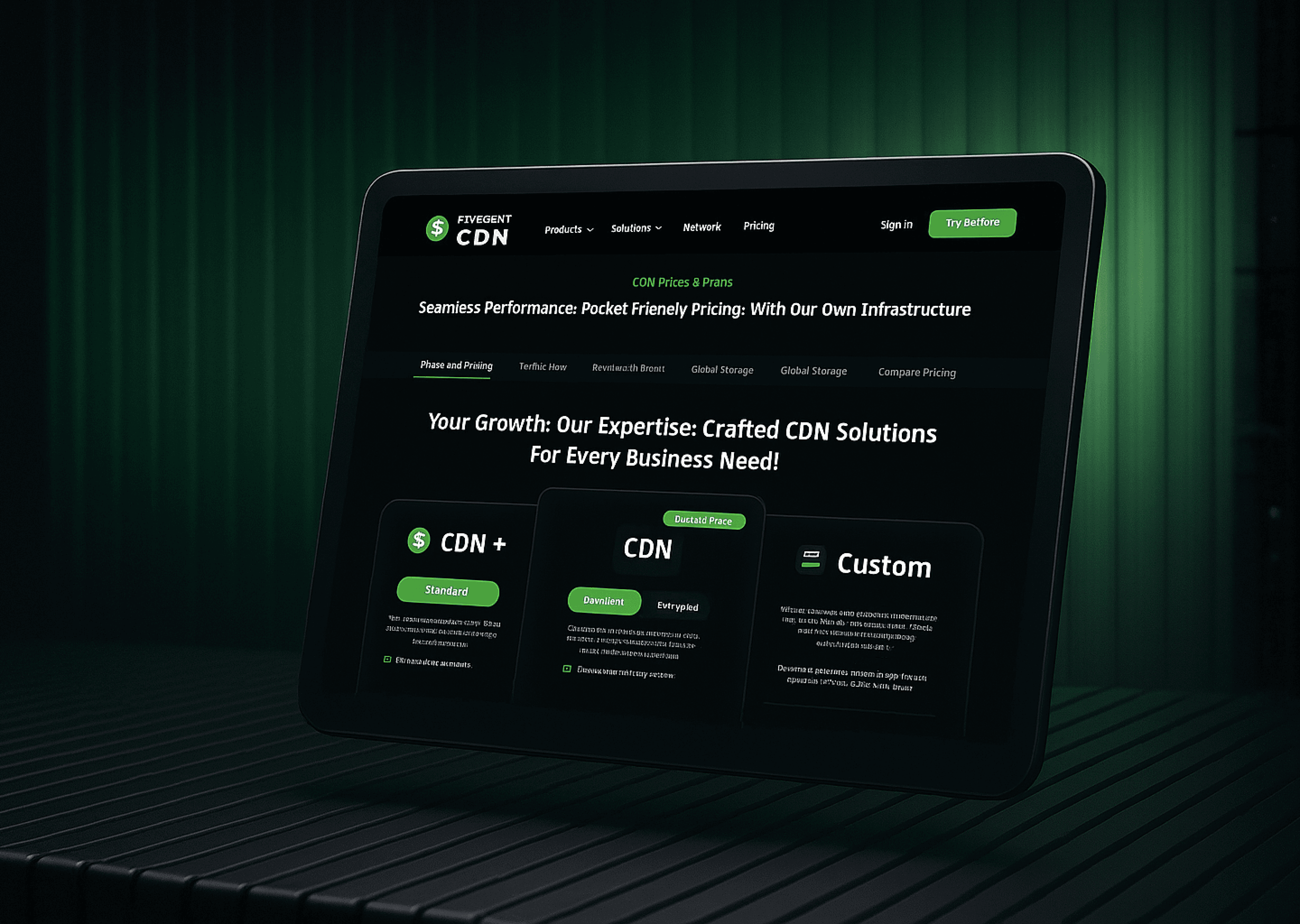
The old pricing page was long, confusing, and caused users to frequently ask support how pricing worked. I redesigned the entire pricing experience to simplify the layout, highlight value, and clarify add-ons. This increased direct purchases by 40%, reduced customer queries by 80%, and increased scroll depth from 20% to 70%.
Challenge
The challenge required restructuring pricing to improve clarity and decision-making. Additional challenges included :
No differentiation between pricing tiers.
Add-ons were misunderstood and felt like “extra charges”.
Users didn’t understand what they were buying.
Extremely long page; poor readability.
Too many options to choose from
Objective & Goal
To deliver a clear, conversion-optimized pricing experience that improves comprehension and reduces support dependency.
Process
The redesign started with restructuring the information architecture to reduce cognitive load. I reorganized pricing tiers, clarified value differences, applied visual hierarchy, and introduced interactive unlockable sections to gamify add-ons. This process included simplifying layout, improving copy, and aligning design with user expectations. Therefore, my process included:
Information Architecture Rewrite
Restructuring Pricing Cards + Feature Comparisons
Gamification of “Unlock Features” Section (add-ons)
Include Boost Section for one-time bandwidth purchases
Add clear CTAs with plan highlights
Scroll depth optimization (collapsing long tables)

Result
Redesigned the onboarding experience for a global CDN SaaS platform to improve user activation and retention. By simplifying the flow, refining plan categorization, and integrating customer segmentation, the redesign achieved 84% more direct purchases, 33% fewer inactive users, and a 78% boost in monthly revenue — proving the power of data-driven UX design in SaaS environments.

Learnings
Applying strong visual hierarchy, anchoring, and clear IA restructuring made it easier for users to understand complex plans at a glance. Turning add-ons into “Unlock Features” reframed them as upgrades rather than extra charges, improving perception and decision-making.
Additional Learnings:
Copy and framing heavily influence user trust.
Scannable layouts reduce comparison friction.
Gamified elements can enhance value recognition.
Tools That Shaped This Project


You’ve seen the results now see
Figma File
I document everything in Figma the ideas, the iterations, the experiments.
Take a peek, it’s all there.
CLICK TO READ
How Delivery Hero streamlines marketing reporting across all their brands with Clarisights. How Delivery Hero streamlines marketing reporting across all their brands with Clarisights. How Delivery Hero streamlines marketing reporting across all their brands with Clarisights. How Delivery Hero streamlines marketing reporting across all their brands with Clarisights. How Delivery Hero streamlines marketing reporting across all their brands with Clarisights. How Delivery Hero streamlines marketing reporting across all their brands with Clarisights. How Delivery Hero streamlines marketing reporting across all their brands with Clarisights. How Delivery Hero streamlines marketing reporting across all their brands with Clarisights. How Delivery Hero streamlines marketing reporting across all their brands with Clarisights. How Delivery Hero streamlines marketing reporting across all their brands with Clarisights. How Delivery Hero streamlines marketing reporting across all their brands with Clarisights